Источник:
http://atinkerersnotebook.com/2013/1...amics-ax-data/
==============
Everyone has used Pivot Tables within Excel at one point in time to create simple reports against Dynamics AX, and some of you may have also used Power Pivot to create more elaborate dashboards and charts. Recently Microsoft extended out the query and reporting capabilities within Excel with the Power BI suite. In addition to extending the Power Pivot capabilities, they also added three more tools called Power Query, Power View & Power Map, and that means that you have a whole new set of reporting options.
In this presentation we will show you how you can use all of the Power BI tools to analyze your Dynamics AX data.
Mapping your data within Excel through PowerView
One of the easiest ways to map your Dynamics AX data is through PowerView directly from within Excel. PowerView will automatically recognize geographic columns as mappable data elements, and will translate them to the map view.
Getting Ready…
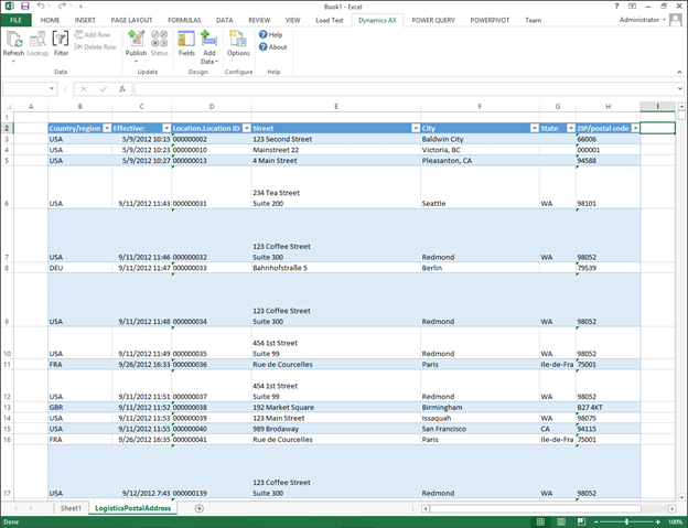
First we need to get some data from Dynamics AX that we can map. You can export the information directly form Dynamics AX, or query the data from Excel using the Dynamics AX Add-In. To do the latter follow these steps:
- Open up Excel, and from the Dynamics AX ribbon bar, click on the Add Data button and select the Add Tables option.

- Search for the LogisticsPostalAddress table, and select the table. When you have done that, click on the OK button.

- When you are returned to Excel, add the Street, City, State and Zip/postal code fields to the worksheet by dragging them over from the field chooser on the left into the worksheet table.

- Click on the Fields button in the Dynamics AX ribbon bar to return to query mode.

- Then click on the Refresh button in the Dynamics AX ribbon bar to query all of the data from Dynamics AX.
How to do it…
To use PowerView to show your Dynamics AX data within a Map view, follow these steps:
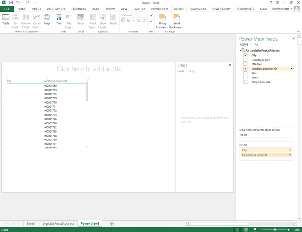
- Now that you have Dynamics AX data to visualize, click on the Power View button within the Reports group of the Insert ribbon bar.

This will convert all of the queried data into a data source and open up a new worksheet with the PowerView designer.
- Remove all of the default fields except for the City and the Location ID from the worksheet, and then click on the Map button in the Switch Visualizations group of the Design ribbon bar.
How it Works…
This will convert the view to a map view and all of your address records will be mapped based on the City.
 Using PowerQuery to Clean up Your Data
Another of the PowerBI tools is PowerQuery. This is an incredibly useful tool, because it allows you to query and massage data directly within Excel. This is especially useful if you only want to report off some of the data, or if you want to pre-filter the data.
How to do it…
To use PowerQuery to massage the data for reporting, follow these steps:
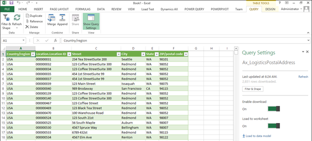
- Select the base data that we just queried from Dynamics AX, and then click on the From Table button within the Excel Data group of the Power Query ribbon bar.
 This will open up a query editor window with your data from the original spreadsheet.

- If you right-mouse-click on any of the columns that you don’t necessarily want, you can select the Remove option to remove them from the query.

- If you select the drop down to the right of any of the columns, then a filter window will appear allowing you to select the values that you want to include within your query. If you click on the Text Filter item, then you can add additional filter criteria. Select the Equals option.
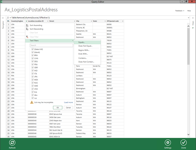
- This will open up a filter detail panel and you can select from the list of valid values. In this example we will select the USA country code and click on the OK button.

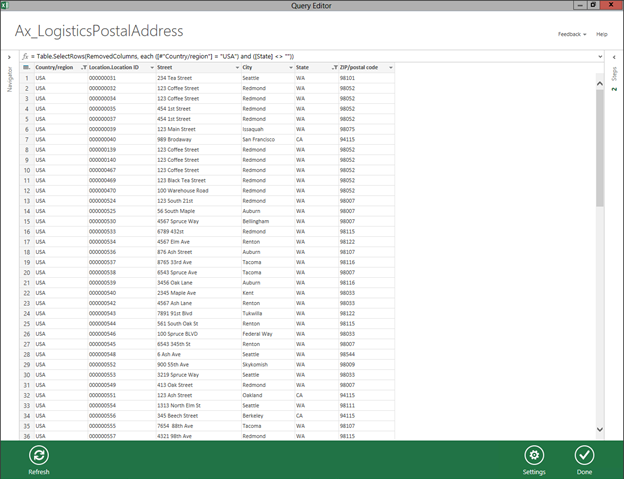
- Now our results will be filtered to just the USA addresses. If there are blanks in the records as there are in our example within the State column, you can select the filter option, and then just exclude any records with blanks.

- Once we have massaged the data, we can click on the Done button in the bottom right corner.
How it Works…
This will move the query results down to the Excel as a new worksheet.
 Using PowerMap to Build Even Better Map Visualizations
Although the PowerView map functions are nice, PowerMap is a much better way to visualize information geographically.
How to do it…
To use PowerMap to visualize the geographic data, follow these steps:
- Select the filtered query that you built in the last section, and then click on the Map option within the PowerMap group of the Insert ribbon bar. Then select the Launch PowerMap option to open up PowerMap.

- When the PowerMap Editor is displayed, it should have already scanned your columns and then associated them with the different geography levels – i.e. City, State, Zip Code etc.
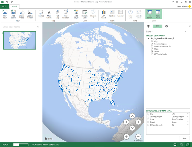
- You can change the mapping level by changing the selection in the Geography and Map Level panel on the right of the view.
- When you have done that, click the Next button to start editing your map visualization.
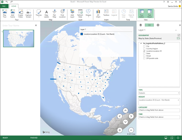
- If you drag the Location ID (or any of the measurable elements in the query) into the Height field on the designer on the right, then your data will start reflecting the impact of the variable.
Using different Visualizations within PowerMap
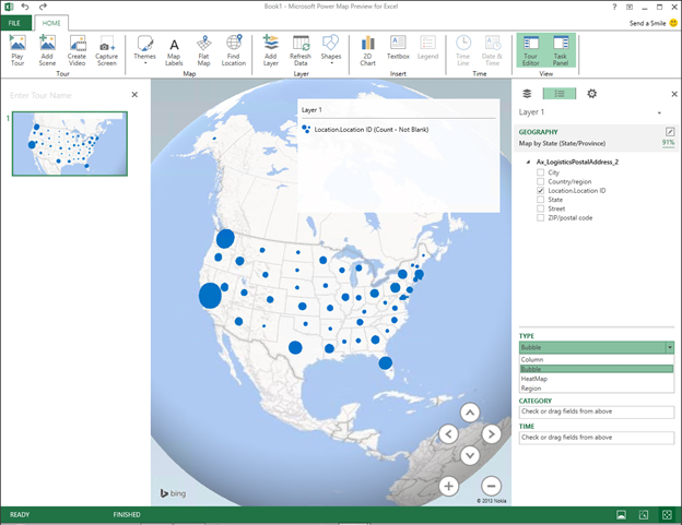
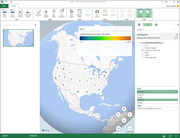
You don’t have to look at the map data just as columns, you can also use PowerMap to show the data as bubble plots, heat maps, and also as regions by changing the map type.
How to do it…
To use PowerView to show your Dynamics AX data within a Map view, follow these steps:
- If you change the Type of the map to Bubble then you will see the different values within the map as bubbles, proportionate to the value of the data point.
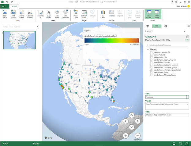
- If you change the Type of the map to HeatMap then you will see the different values within the map as hot and cold color ranges to the value of the data point.
- If you change the Type of the map to Region then you will see the entire region – i.e. state, zip code shaded in a color value that reflects the value of the data point.

Using PowerQuery to Merge Datasets
Up until now we have just been looking at the data from one data table within Dynamics AX. If you want to merge multiple tables together, then you don’t have to resort to using SQL statements, or building complicated queries, you can use PowerQuery to merge the data for you.
Getting Ready…
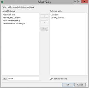
For this example we will need to add in some more tables into the workbook so that we can link the postal addresses with the customer accounts. To do this, follow these steps:
- Click on the Add Data button in the Dynamics AX ribbon bar, and selecting the Add Tables option.

- When the table selection dialog is displayed, add the CustTable and the DirPartyLocation tables to the selected tables, and click the OK button.
- When you return to Excel, click on the Fields button in the Dynamics AX ribbon bar to exit design mode.

- Then click on the Refresh button in the Dynamics AX Ribbon bar to refresh the data in the table queries.

How to do it…
To use PowerQuery to combine multiple sets of data into one dataset for reporting, follow these steps:
- Select the CustTable table and then click on the From Table button within the Excel Data group of the Power Query ribbon bar to turn it into a query. Then click the Done button.
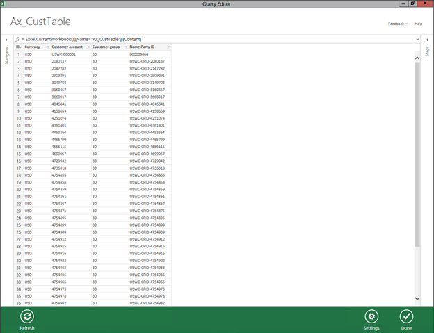
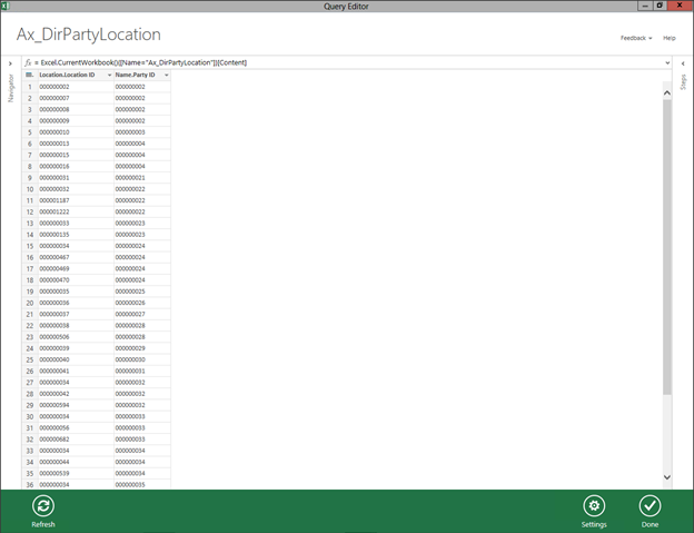
- Also select the DirPartyLocation table and then click on the From Table button within the Excel Data group of the Power Query ribbon bar to turn it into a query. Then click the Done button.
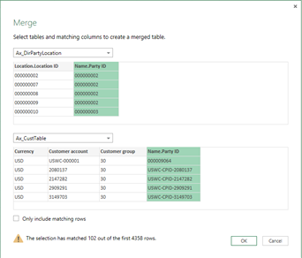
- To merge the DirPartyLocation and CustTable queries, select the DirPartyLocation query table within the workbook, and then click on the Merge button within the Combine group of the Query ribbon bar.

- When the Merge dialog box is displayed, select the CustTable query as the child table and then select the two columns that you want to match the tables on – in this case the PartyID. When you have done that, click on the OK button to return back to the query builder.
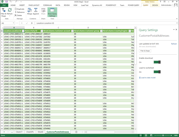
- Your new merged query will show up as a new worksheet, but the columns from the CustTable are not showing up.

- Click on the NewColumn that was created, check the fields that you want to show in the new query, and then click OK.

- Now you will see all of the columns from the CustTable showing up in the query. When you are done, click on the Done button to return to the Excel workbook.

- We now want to take this link one step further, and merge the new query with the postal address so that we can see the customers with their appropriate address information. So select the query that you just created, and then click the Merge button again. This time, for the child form, select the LogisticsPostalAddress query and then link the two queries by the LocationID column.

- When the new query is displayed, expand the NewColumn and select all of the address columns from the LogisticsPostalAddress table.

- Just to make everything tidy, double-click on the header of the query, and you will be able to rename the query to be something more descriptive, and then click on the Done button to return to the Excel workbook.

How it Works…
Now you will see a merged query of the three tables.

If we select the query, and click on the
Map option within the
PowerMap group of the
Insert ribbon bar. Then select the
Launch PowerMap option to open up PowerMap and we will see all of the new fields that are available for reporting.
 Flattening Maps
Even though the world is round, it does not mean that you have to look at it that way all of the time. PowerMap has a cool feature that allows you to switch from the globe view to a flat earth view.
How to do it…
To flatten your maps, follow these steps:
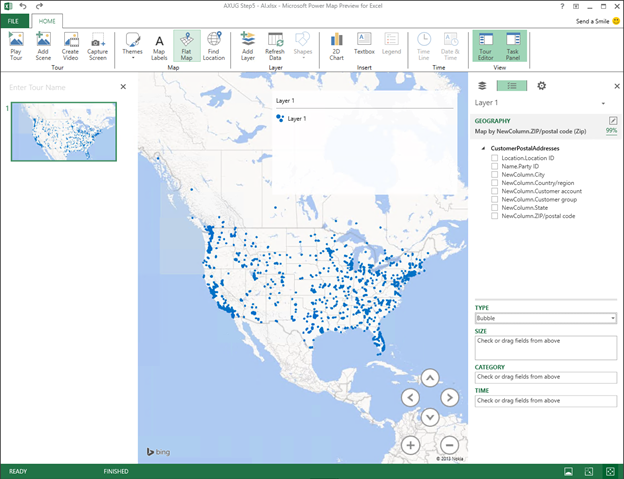
- Just click on the Flat Map button within the Map group of the Home ribbon bar. You can use the arrow buttons in the bottom right of the map to change the perspective of the map as well.
Adding Labels to the Maps
As you zoom in on the maps, you may want to see information about the areas that you are looking at. You can easily do this by turning on the map labels.
How to do it…
To turn on the labels on the maps, follow these steps:
- Click on the Map Labels button within the Map group of the Home ribbon bar. As you zoom in on the map, different labels will be displayed depending on the level of detail that is available.

Using PowerQuery to Integrate External Data
One final feature that we will highlight of the PowerBI suite is the ability to incorporate external data into your dashboards through the PowerQuery tool. With PowerQuery you can query databases, web sites, and even text files and then link them in with the more traditional queries that you have created up until now. This allows you to store external information for reporting in CSV files for example, and then use them as if they were in the database.
How to do it…
To incorporate data within a CSV file into your queries, follow these steps:
- From within the Power Query ribbon bar, select the From File button and select the From CSV option.
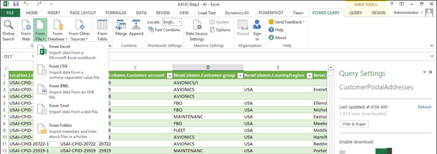
- Find the CSV file that you want to add to the query. In this case it’s a database of census information by zip code that also contains population estimates. When you have selected your file, click the OK button. Your CSV file will now be shown in the Query Editor.
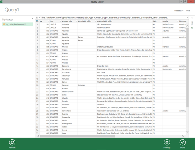
- If some of the fields have been mis-typed (like my Zip code which the import thought was a number) then you can right-mouse-click on the field, and select the Change Type option and select the right data type for the column.

- If you want, you can also create custom columns by right-mouse-clicking on the query editor and selecting the Custom option from the Insert Column menu.
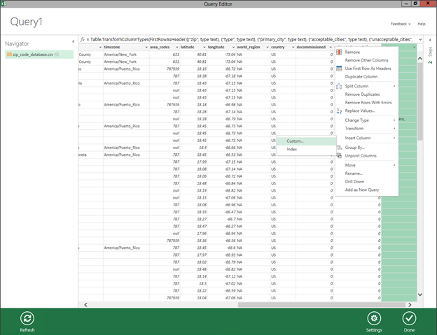
- When the Insert Custom Column dialog box is displayed, you can build a formula just like you can within Excel. In this example we calculate a ratio on the population field.

- Once you have made any adjustments to the query that you like, then you can click the Done button to save your query back to the workbook.

- Click the Merge button again and you can link the query that you created with the Customer Addresses query from the previous sections.

- You can then include any of the CSV files data into your new super query.
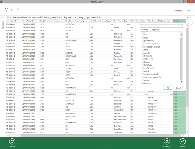
- When you are done, click on the Done button to return back to the Excel workbook.

How it Works…
If we select the query, and click on the
Map option within the
PowerMap group of the
Insert ribbon bar. Then select the
Launch PowerMap option to open up PowerMap and we will see all of the new fields including the population data that we just added, and we can map the customers by hotzone.
 Summary
PowerBI marries a number of useful analytics tools together to help you analyze your data, and to be able to analyze your data geographically is one of the cooler features.
After you have mastered the basics of the PowerBI suite though you can start using some of the other features such as:
- Creating multiple layers within PowerMap to merge data
- Using PowerQuery to access information from web sites and XML feeds
- Create labels and information panels in your PowerMaps
- Create tours that animate your maps through storyboards
There is so much that you can do with PowerBI, try it out.


Источник:
http://atinkerersnotebook.com/2013/1...amics-ax-data/


