|
|
#1 |
|
Участник
|
dynaxtips: D365 Operations on a Mobile phone
Источник: https://dynaxtips.com/2016/11/14/d36...-mobile-phone/
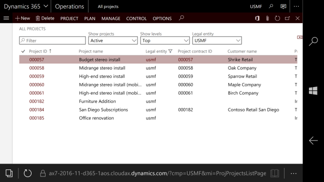
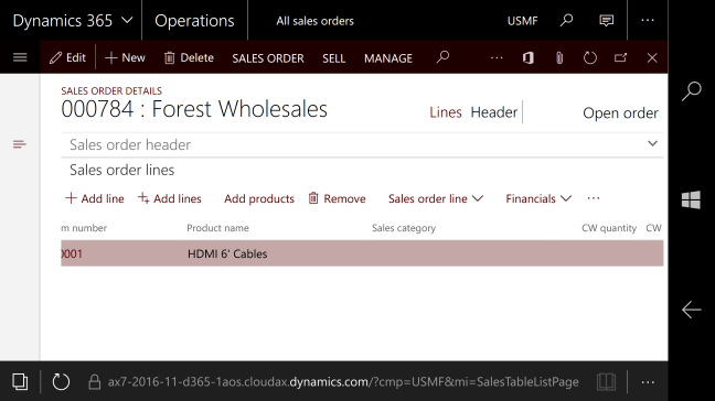
============== There are two ways that D365 Operations are supposed to be interacted with on mobile phone. We’ve got the Mobile App with the awesome foundation that can basically expose any form to the end user in a mobile format, and then we have the WHS Mobile Terminal interface that covers all operations in logistics as well as all logistics for manufacturing operations. But probably the most common way people will experience interfacing with the application on mobile would be to a browser on a mobile phone to the HTML 5 general client. I did try this out pretty early on and wrote about it. The experience wasn’t all that amazing, but it worked in a way. That was three versions ago, so I’d thought I’d have another crack at it.  The dashboard works very well and the module navigation now takes a full screen experience that I really liked. One of the first things I noticed was that the interface now was much better on a cell phone. The previous version had two rows when looking at detail forms and that made the experience pretty “scrolly”. Mobile interfaces are best when there is only one way of scrolling required, either vertical or horizontal, but once you put data in both axis of your field of view it can get a bit disorienting and hard to find the data. I am happy to report that this has been dealt with and is now a much better experience. The work centers function pretty good as well. It is aligned to work in the horizontal axis, but scales pretty well in both portrait and landscape mode. There is an issue with interaction on grids as these naturally would be horizontal in nature. However the experience is very nice as the scrolling now only affect the grid it self and the rest of the data stays static. This is also where the Mobile App shines as you can transform grid lines to be a field list interaction that is more suited for mobile entry.   The only place I experienced a bit of a disconnect with the interface was on the dialogue boxes. In this case they still don’t go full screen, but has the menus peeking through on the left side of the screen. It also puts data in two columns that require some two axis navigation. Not horrible, but not perfect either… All in all it was a much better experience then the last time. The forms scale very well to the mobile format and it is a very smooth experience that can stack up to any web application for mobile interface. I am impressed and very enthusiastic! Filed under: AX7 Источник: https://dynaxtips.com/2016/11/14/d36...-mobile-phone/
__________________
Расскажите о новых и интересных блогах по Microsoft Dynamics, напишите личное сообщение администратору. |
|
|